Seasonal photography: presets for spring, summer, autumn and winter
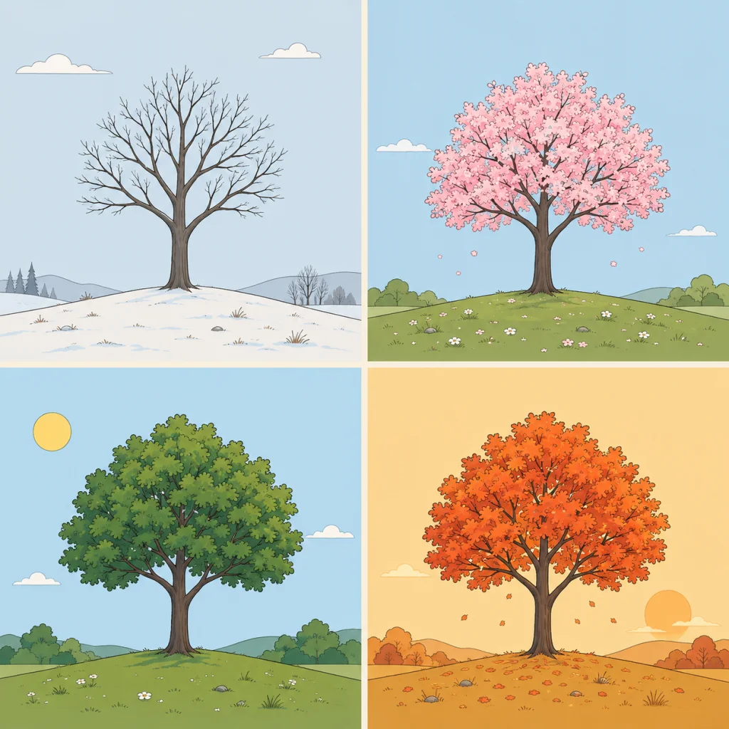
The same street, the same park, twelve different photos: that is what a season does to light and colour. The Vier Seizoenen category follows that through the year, with its own preset per month instead of one preset meant to cover the whole year.
Winter: low, cool light
In Januari and Februari the sun sits low and the light is often flat. These presets keep the coolness in the colour instead of warming it up, which makes a photo in snow or under a grey sky look more believable than a preset that adds warmth there instead.
Spring and early summer: fresh and clear
April and Juni play into the fresher, clearer light of that part of the year. Green gets room to breathe without oversaturating, which looks more natural on outdoor portraits and garden photos than a summer preset used too early in the year.
Autumn: warm and saturated
With September the balance shifts to warmer, more saturated tones, matching autumn colours and the lower autumn light. This is one of the presets that gives away the wrong month fastest if you use it out of season: too warm for a spring photo, exactly right for a lane full of leaves.
Festive winter: dark and atmospheric
December is built around low, warm light: candles, festive lighting, short days. Use it on evening shots indoors, not on daylight photos, where the warm tone quickly takes over.
One preset per moment, not per project
Working on a series that spans the whole year, such as a family project or a recurring location? Deliberately pick the preset of the month the photo was taken in. That keeps the colour matching what the photo conveys, instead of forcing one style across every season afterwards.
