Travel presets for mountains, coast and city: which look fits where
Travel photos differ not only in subject, but also in what the colour needs to do. Mountains want depth, coastlines want calm, a city often wants character. So one travel preset for everything does not really exist.
Mountains: cool and deep
The Bergtop category is built on cool, clear tones that keep depth in the landscape, such as Alpengloed for golden hour high in the mountains or Sneeuwkap for snow-capped peaks. On mountain photos, avoid presets that warm the colour too much: that flattens the depth between foreground and background.
Coast: calm and light
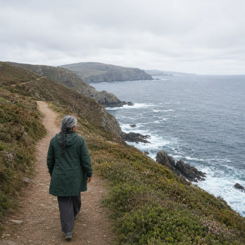
Around water, calm works better than drama. Zoutwater keeps sky and sea light and clear, with presets such as Kustlijn and Zeebries. For a whole coastal report in the same mood, the Zeezout pack is a more direct route than hunting for single presets.
City: contrast and character
A city calls for more direction in the colour. The De Stad category gives every city its own palette, from Parijs to Tokio: where mountains and coast look for calm, a city photo can carry more punch.
One trip, changing images
Shooting both mountains and city on the same trip? Feel free to use different presets per subject instead of hunting for one style to cover everything. That gives the best result per photo, even if it looks like more work at first.
